Compass
A mobile application to help college students find interest groups
on campus to better engage with the student community.
on campus to better engage with the student community.
.png)
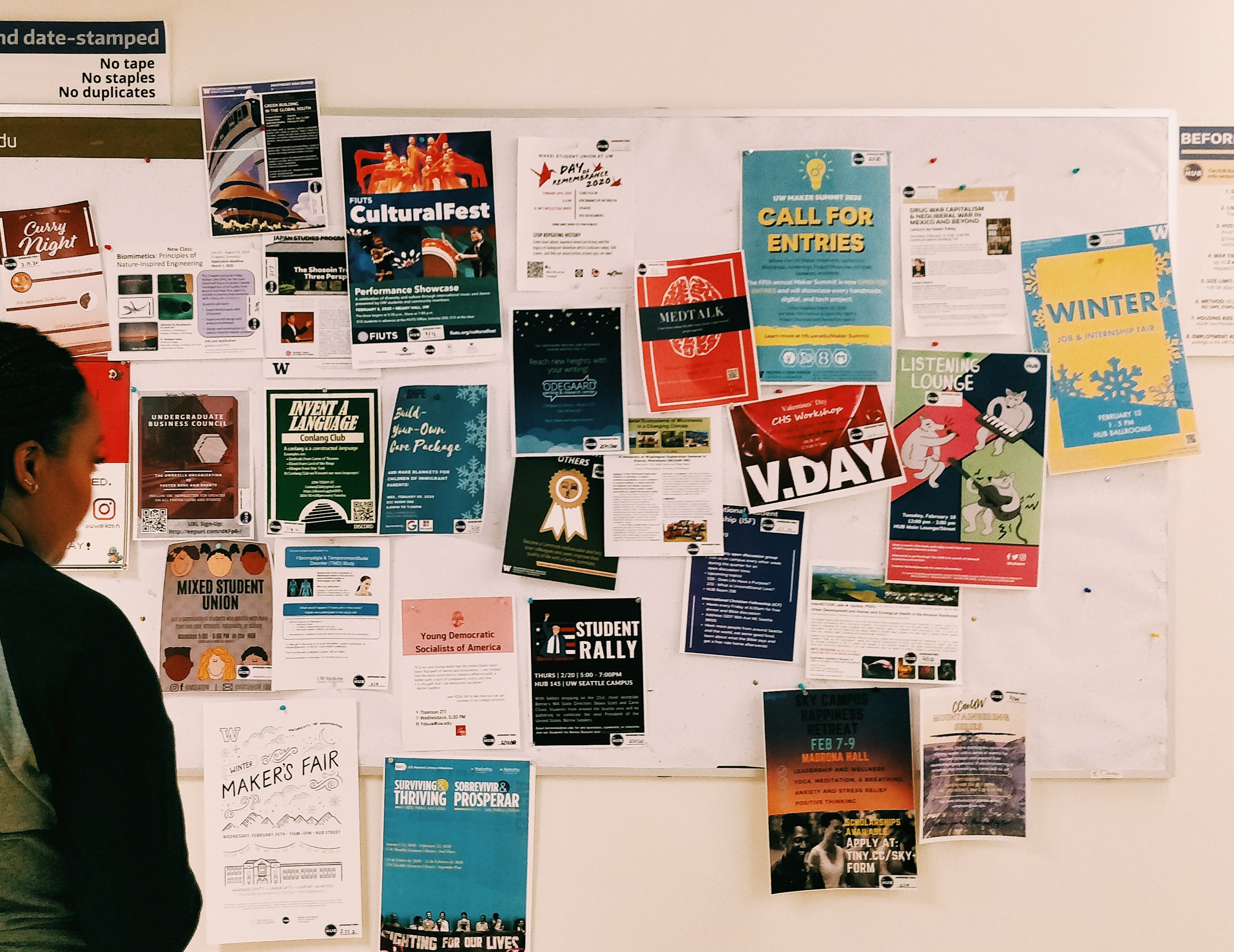
There is typically no shortage of resources for college students to use, but the way they are organized is not always logical, accessible, or user-friendly. There isn’t a dedicated platform that allows students to collaborate and cooperate with the student community.
To turn what might be an impersonal campus experience into a community-like experience where students can share resources.
How might we design a solution that enables college students to naturally engage in social and academic activities in their college experience while simultaneously contributing to the student community?
The survey covered key aspects of target users’ experiences through satisfaction, multiple choice questions, and agreement scales. We received 59 responses.
88.1% heard about collaboration opportunities from their classmates.
47.5% didn’t feel a connection with the student community.
25.4% said it is easy to keep up with activities in the student community.
We chose IDIs both for convenience and ability to probe more deeply on our areas of interest. To invite participants, we put together a quick survey which resulted in 5 interested participants. We conducted 3 interviews in person and 2 remote using the protocol we developed as a team.
Since our solution is a mobile application, we decided to conduct a competitive assessment of the available apps that aim to address some of the same user needs as our proposed solution. We approached this analysis by
.png)
I want to go try rock climbing, but I don’t know anyone who does it. I don’t know where to go. Yeah, unless like I know someone around, I can ask them, but if I don’t, then I don’t know where to go.
Participant 1
After the user research, we used affinity mapping to identify themes in our data.
1. Wrote down the codes that most represented the data
2. Rearranged the notes to identify common themes
3. Substituted each theme with a ‘How might we’ question
This activity helped us refine our design question and identify our primary user persona.

Even if there were so many resources available around campus, students still found it hard to navigate through all of them. This was mainly due to the fact that was currently no single platform that focused on helping students discover events or clubs on campus.
One insight from the interviews was that students tended to form groups within the people they already knew because they could’t find another way to join a group with students of the same interests, both academically and socially.
There was lack of appropriate guidance for students to learn about other on-campus collaboration opportunities outside of their social circle.
We designed empathy maps to better define the attitudes and behaviours of the user groups.
.png)
.png)
How can we design a mobile application that enables college students to find and engage with interest groups on campus in order to enhance college experience for themselves and others?
Based on the insights gathered we brainstormed some feature ideas as a team in the form of rough sketches. We then grouped similar features and talked through pros and cons for each of them. Finally, the team did dot voting to prioritize and select features to prototype.
Below, I detail some of the design decision that I made.
.png)
To structure the information we had to introduce two levels of separation- groups and events. Every event would belong to a group and the group could either be an official UW body or a casual group. This would ensure content moderation.
.png)
We created user flows for each scenario to better understand how information is going to be laid out. The diagram below is the happy path for a user who wants to joins a new group.
.png)
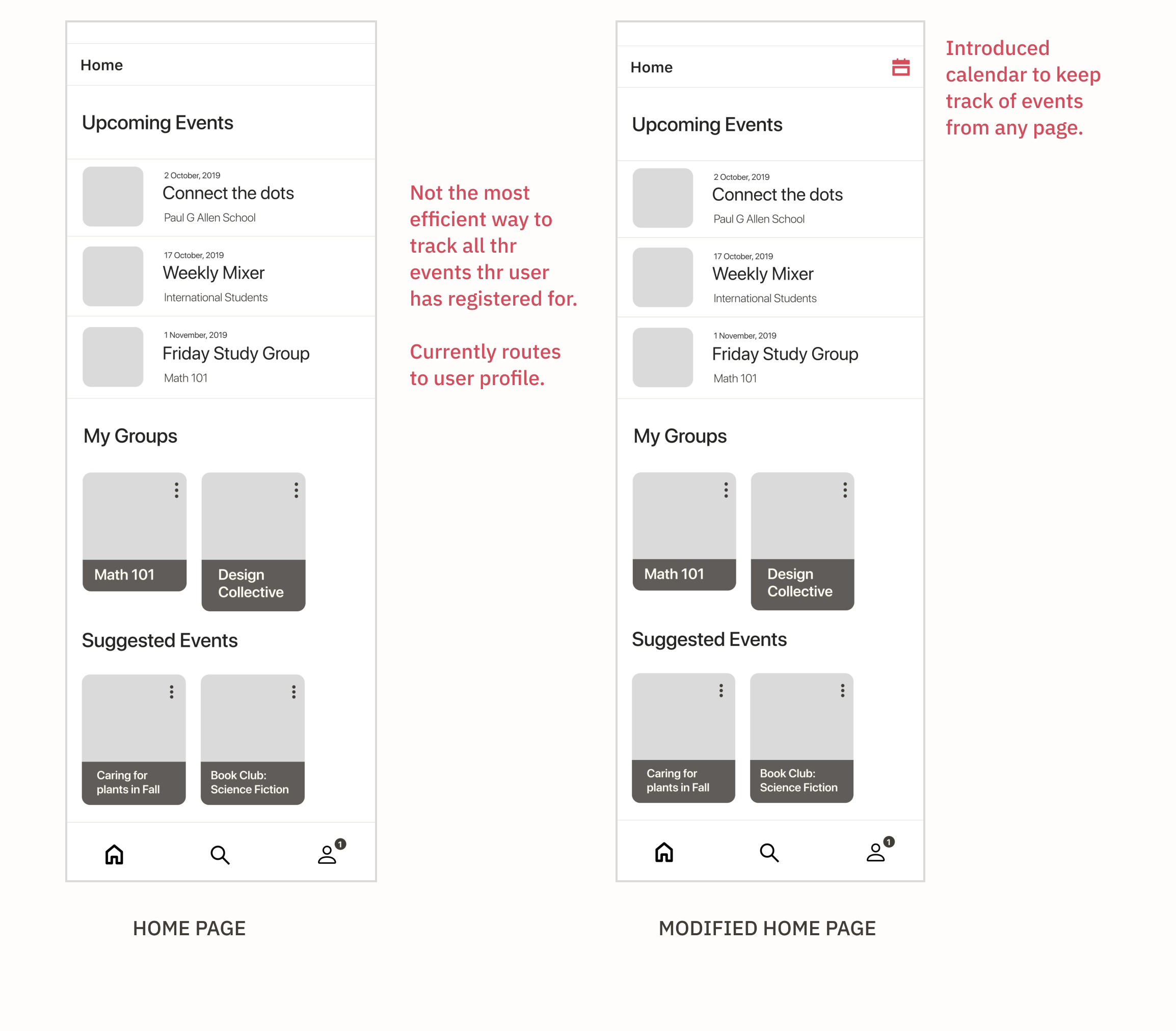
We conducted usability tests on our mid fidelity prototypes. The usability tests were quick and dirty. They were conducted with 3 participants in 2 rounds.
Below were some of the important insights -
The design of My Groups card and Suggested Groups card was intentional because a user might want to read a short description of the group when exploring but wouldn't want to read descriptions when they are already part of the group. But the same can't be said about Suggested Events on homepage and explore page, the design is inconsistent.
.png)
Participants were confused by the placement of the notification section in the user profile page. The design also made it harder to view notification history.
.png)
Upcoming Events section lists the events that the user has registered and will receive notifications for. Listing them all on the homepage wasn't be an efficient solution in any case that the user is registered for more than 3 events. Participants expressed the need to visualize events based on date and time.
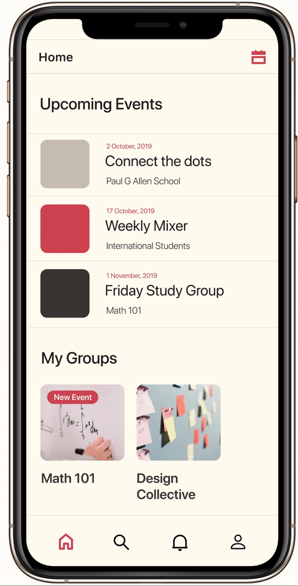
The findings from the usability tests were used to drive design decisions for the final interactive prototype. Here's a highlight of few exciting features -
At every step we wanted to provide options and cues for the users to explore groups and events. Exploration is possible either through suggested content or through carefully curated categories.
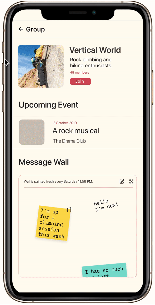
We wanted to introduce a way for members within a group to communicate. We didn't want to go the traditional messaging interface as one of the objectives was to find an effective way to connect virtual and real life environments. We believe message walls in each group would provide a fun and engaging way of communication. To better regulate the content, the wall is cleared once every 7 days.
About 50% of the respondents to the survey were HCDE undergraduate and graduate students since they were an easily accessible population. Having equal responses from the other UW departments may have yielded slightly different and richer results.
Since the user research was done only with The University of Washington, the transferability of the application to other schools still has to be examined.
The issues surrounding privacy and communication in these groups are still to be addressed. Our inspirational wish list includes the addition of campus maps and facilities, which a lot of our users expressed a need for, but was beyond the scope of our the project.
We started the project with a broad problem area and understanding. Once we got done with the exploratory research, we decided to focus on a specific problem and set up certain constraints for ourself. This step helped us dig deeper into the problem space and identify actionable solutions. I learnt to embrace and enjoy designing with constraints through this project.