Collaborative Marine Atlas Project (CMAP)

Redesigning an open source data portal to meet the needs of oceanographers.

Simons CMAP is a data portal that houses large ocean science datasets. The platform also supports data visualisation based on region, date, and other similar variables.

The project that started as a user study with a group of UX Researchers, evolved into a passion project in which I redesigned the data portal.

MY ROLE
The usability testing was done in collaboration with UX Researchers and I was the sole designer (passion project) involved in the ideation, design and prototyping.
TOOLS
Figma, Adobe Illustrator, Stark, Framer
COLLABORATORS
4 UX Researchers
TIMELINE
12 weeks

Context

I was part of a research team at the University of Washington that worked with the team that designed and built SIMONS CMAP - an open source data portal for oceanographers. Our team was tasked with identifying user needs and testing if the portal met the needs of oceanographers or anyone who might have access to it. We conducted usability studies that combined task based analysis and exploratory questions to identify user types and pain points.

INITIAL BRIEF

Discover the needs of people who search for ocean science data sets and evaluate the efficiency of the CMAP tool in helping satisfy these needs.

A snapshot of the final design

Insights from
user research

After conducting usability tests and interviews, we drew some common themes and recurring pain points. These themes include large issues about the workflow to small usability and aesthetic issues.

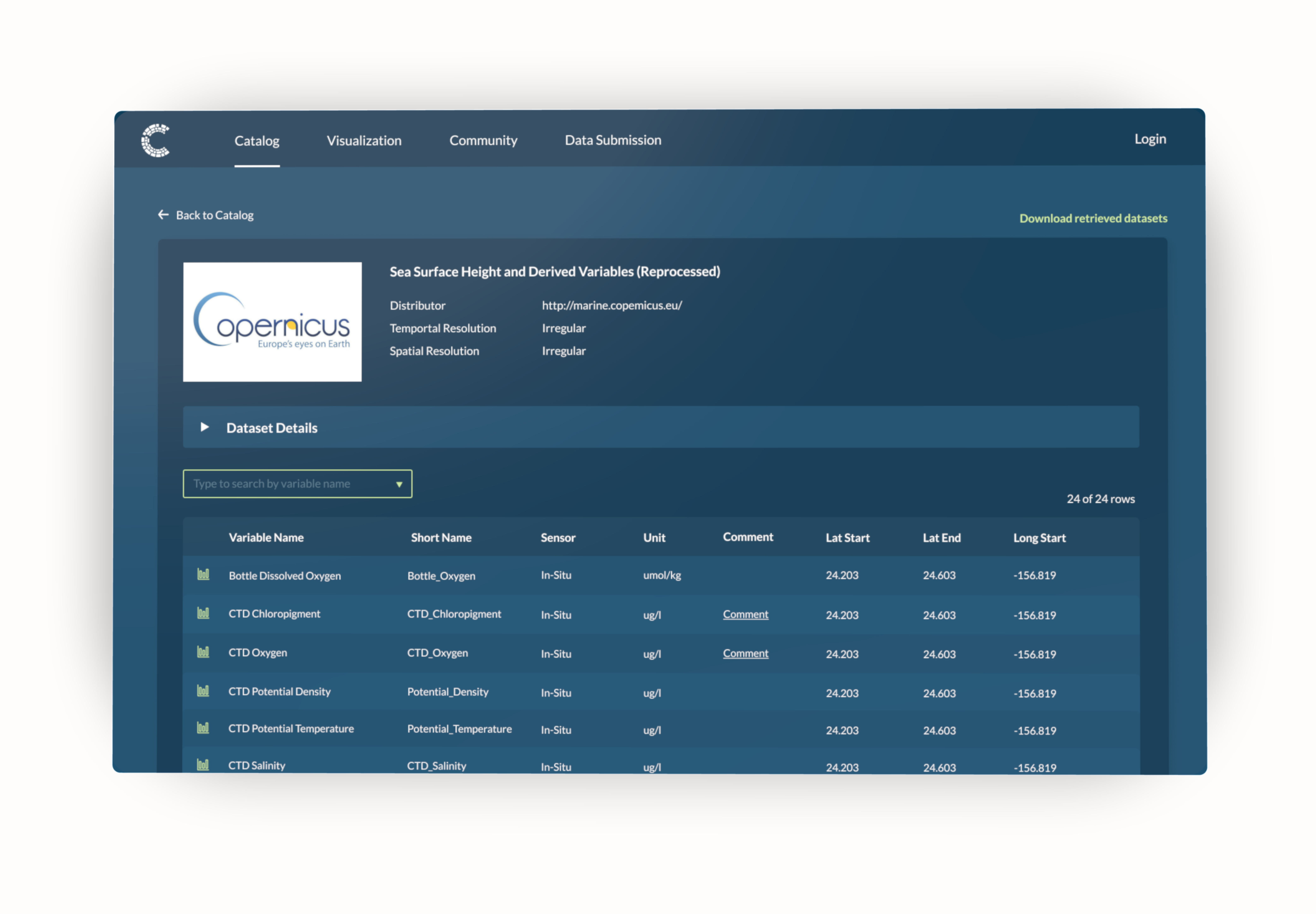
DATA LOOKUP WAS HARD

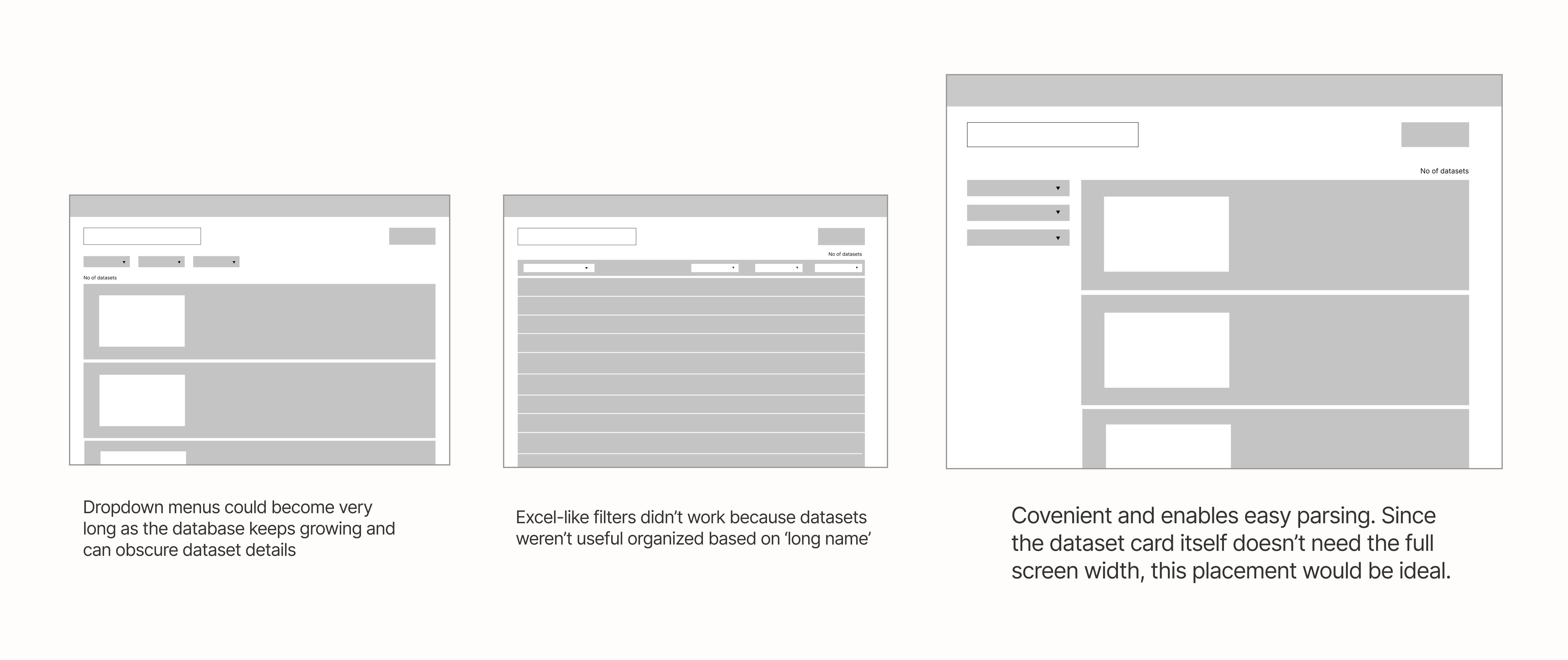
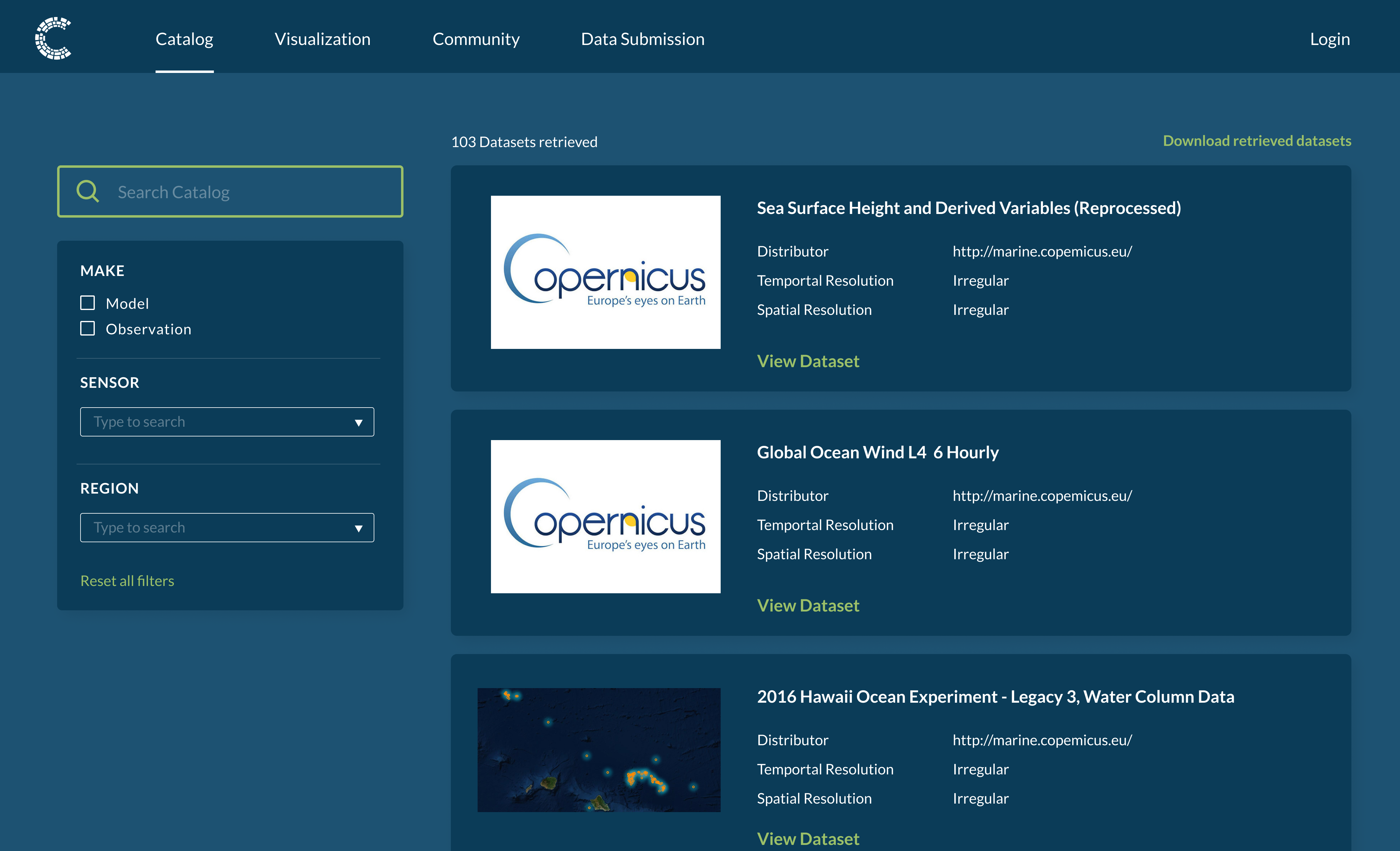
Data lookup was time consuming and not straightforward. The data tables could be filtered by dragging column names but this feature wasn't apparent to the participants. Additionally, the default state of the Catalog page displayed the datasets filtered by their names. This default state was misleading to users who might want to explore the original data sets.

VISUALISATION FEATURE WAS NOT APPARENT

Participants were used to downloading datasets on their computer to visualise it on Microsoft Excel or other similar tools. Hence, when asked to visualise datasets on CMAP, participants usually downloaded datasets instead of using the visualisation tool within the platform.

LOTS OF SCROLLING

Participants scrolled through the data tables in many instances either to find a specific dataset or to explore. Since CMAP has a large number of datasets, participants often didn't know what to expect or when to stop searching.

VAGUE TERMS and JARGONS

CMAP used quite a few technical terms that some participants found to be vague, leaving them lost for context. For example, the datasets on the Catalog page were filtered by their 'long name' and some participant said that they didn't understand what that meant.

Two broad types of users emerged.....

The user research also helped us discover that there are two types of users who might use CMAP - The Specialist and The Explorer. For this project, I decided to focus on the Explorer persona because of the frustrations they experienced when using a data portal.

Mapping user workflows

To better understand the workflows of the Explorer persona, I mapped out high level user flows during data lookup and data visualisation. This activity revealed two major problem areas which hindered workflows. The first pain point was the lack of discoverability and a Catalog page that didn't encourage exploration. The second issue was the break in the workflow that required users to lookup data twice when wanting to visualise a particular dataset.

How can users explore and visualize ocean science data sets that might be new to them?

Design

Rapid wireframing to explore design ideas

To explore multiple design ideas, I took to creating wireframes to visualise and evaluate each decision. For example, to enable easy lookup in the Catalog Page, I decided to utilise filters. I explored multiple designs to enable search filtering - a horizontal toolbar, utilising a sidebar, or column-wise filters as in Excel.

REFRESHING THE VISUAL SYSTEM

The participants appreciated the visual system of the existing design since they weren't used to data portals that employed a good visual sense. Despite this, I wanted to tweak the visual system. The first reason was that the colors employed didn't meet accessibility standards and there were color contrast issues. The second change was using cohesive icons to replace the old icons that lacked context.

Hi-fidelity designs

After designing individual components, I prototyped the designs in hi-fidelity on Figma.
Below, I showcase some major changes, screens, and workflows.

Search filters for lookup

The Catalog page was redesigned to include a sidebar with search filters. Additionally I added cues to indicate that a search was successful. I also fixed the information hierarchy of the dataset cards to make it more readable.

Better data tables

I also redesigned the data tables for easy parsing. I included a toggle menu to house the longer dataset details. I introduced icons for repetitive action, for example each row has a visualise action.

Efficient workflow

I also added functionality to directly visualise data variables from the Catalog page. With this feature, users don't have to lookup data twice.

What did impact
look like?

To measure the impact of the new changes, I decided to conduct usability tests with a set of participants who fit the Explorer persona. The time on task and task completion was calculated. For certain tasks, think aloud protocol was employed to gather qualitative data. Users expressed satisfaction with the redesigned user flow.

Takeaways

DESIGNING FOR DISADVANTAGED USER GROUPS

In this project, focusing on the Explorer persona helped reveal many common issues while uncovering specific issues pertaining to the persona. I believe that by solving for the disadvantaged user (not a subject matter expert), we end up thinking about workflows and sitemaps in more granularity thereby generating richer ideas.

DON'T BE AFRAID TO EXPERIMENT WITH NEW PATTERS

While I used many tried and tested design patterns, I learned that it is okay to experiment with new patterns in certain situations. This process also got me excited to design for new experiences.